
Article Key Takeaways
- You decide whether to trust a provider before you can judge anything about their actual clinical quality. Branding is what fills that gap, whether the organization built it on purpose or not.
- Color, typography, and physical space aren’t decoration. Patients read them as clinical signals.
- A framework beats a mood board. The healthcare branding strategies that actually hold up start with research and alignment, not a new logo.
- The worst healthcare branding failures don’t look bad. They look fine and get ignored the moment the launch party ends.
- B2B healthcare company branding sells stability to a committee. Patient-facing branding sells reassurance to one anxious person. Design them differently.
- Brand equity has numbers attached to it: acquisition cost, referral rate, review language, staff turnover. None of it requires a formal brand-tracking study.
Why Branding Matters More in Healthcare Than Almost Any Other Industry
You can’t tell if a surgeon is good by looking at them. You can’t tell if an insurance plan will actually pay out by reading the homepage. In healthcare, you’re constantly forced to make high-stakes decisions with almost no way to verify the thing that actually matters. So you reach for whatever you can evaluate instead: does this look like it was made by people who take the work seriously?
That one question is the value of branding in healthcare, in a single line. It does more work in this category than in almost any other, because the decision it’s standing in for isn’t picking a hotel. It’s a bet on safety.
The Trust Gap Is the Brand Gap
You can’t audit a clinic’s outcomes data before you book an appointment. What you can judge instantly, without even meaning to, is whether the brand looks competent.
That’s the trust gap: the space between what you need to believe and what you can actually check. Branding in healthcare industry fills it, for better or worse. A cluttered scheduling page. A logo that hasn’t been touched since 2011. Colors that don’t match between the app and the actual clinic walls. None of that reflects clinical quality directly, but you treat it as evidence anyway. Sloppy branding reads as sloppy everything, fair or not.
The Market Is No Longer Local or Captive
Healthcare used to be geography. You went to whoever was closest, or whoever your insurance let you see. That’s mostly gone now.
Telehealth and direct-to-consumer health apps turned healthcare into something you actually shop for, comparing providers you’ve never set foot in. Once the decision moves fully online, there’s no waiting room to soften a bad first impression and no receptionist to smooth things over. Just a homepage and a few seconds to make the sale.
B2B Healthcare Branding: A Different Game
If you’re marketing to a hospital procurement committee, you’re not earning the same kind of trust as a patient walking into a clinic, and treating the two the same is one of the most common mistakes in branding in the healthcare industry.
A procurement committee isn’t judging warmth. They’re judging risk: will this vendor pass a security audit, survive a regulatory change, still exist in five years? That calls for restraint over emotion, data visualization over lifestyle photography, and messaging built for five stakeholders reading the same deck instead of one person scrolling on their phone. Healthcare company branding for enterprise vendors runs on entirely different instincts than anything patient-facing. If you’re building enterprise brand identity for a health-tech or med-device company, you’re designing for a boardroom, full stop.
The Psychology of Visual Identity in Clinical Settings
So how does visual identity affect patient trust in healthcare, exactly? You process a face, a color, a layout faster than you process a sentence. Walk into a clinic or open a health app, and that snap judgment gets mapped directly onto how competent the organization seems, before you’ve read a single word of copy. Trust gets decided in that first half-second, not in the fine print.
Color Psychology in Healthcare Branding
Blue is everywhere in medical branding because it works: clean, clinical, calm. It’s also why so many healthcare brands are indistinguishable from each other. Choose blue, and you get instant credibility and instant sameness in the same move.
Green has claimed wellness and prevention. Warmer tones, coral, amber, soft yellow, show up more in mental health and pediatric branding, where the job is different: soften the clinical edge instead of reinforcing it. The real mistake isn’t choosing blue when green would’ve fit better. It’s picking a color before deciding what emotional register the brand actually needs.
Typography and Perceived Competence
A diagnostic device brand and a postpartum wellness app should never share a type system, even though both want to look trustworthy, because “trustworthy” means something completely different to each audience.
A round, friendly typeface undercuts a brand that needs to project authority. A geometric, hyper-precise sans makes a warm, patient-first brand feel like a government form. Type isn’t styling here. It’s a claim about how you want to be believed.
Environmental Branding and the Clinical Touchpoint
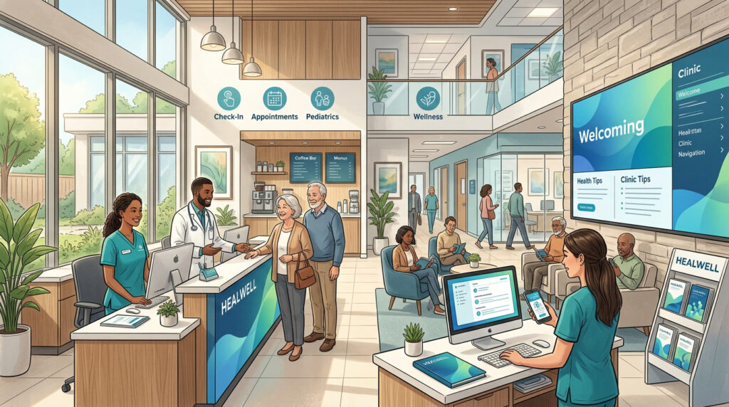
Branding doesn’t stop at the screen, and most healthcare organizations forget that constantly. Signage, exam room lighting, even the material on a waiting room chair register with a patient who’s often already anxious before they walk in.
Harsh fluorescent lighting and generic corporate signage read as cold at exactly the moment a patient needs the opposite. And when the digital brand is warm and modern while the physical space still feels like 2003, patients notice the gap even if they couldn’t explain it out loud.
What role does employee experience play in healthcare branding? A bigger one than most brand teams give it credit for. The nurse at the front desk, the technician doing intake, the receptionist answering the phone: they deliver the brand promise in real time, in a way no signage ever will. Staff who don’t understand or believe in the brand end up contradicting it dozens of times a day, no matter how good the guidelines look on paper.
Healthcare Branding Strategy: A Framework That Actually Works
Most healthcare rebrands fail for a boring reason: nobody had a plan past “new logo.” A framework worth using needs four stages. That’s the logic behind PACE.
| Stage | What it does | Common failure point |
| Perceive | Research how patients, staff, and referral partners actually experience the brand today, not how leadership assumes they do | Skipping research and jumping straight to visual concepts |
| Align | Get clinical, marketing, and operations leadership agreeing on what the brand needs to signal before any design work starts | Marketing approves the design alone, then clinical staff quietly ignore it |
| Consistency | Roll the brand out across every touchpoint (digital, print, signage, staff communication) at the same time | New logo on the website, old signage in the clinic for another two years |
| Evolve | Revisit the brand against real outcomes like acquisition cost and staff adoption on a set cadence | Treating the rebrand as done the day it launches |
The stages you’ll be tempted to skip are Perceive and Align, and that’s exactly why so many rebrands land flat. Design without research is a guess dressed up nicely. A full rebranding engagement that actually holds up spends real time in those first two stages before a single visual gets approved.
What Not to Do: The Most Common Healthcare Branding Mistakes
If you’re wondering what are the biggest healthcare branding mistakes to avoid, they tend to fall into four buckets: no real reason for the rebrand, guidelines nobody follows, marketing standing in for branding, and a digital brand that doesn’t match the physical one.
Rebranding Without a Reason Patients Can Feel
If the only thing driving your rebrand is a new CMO who doesn’t like the old font, patients will clock it as cosmetic, because it is. Tie the rebrand to something real: a new service line, an actual change in how care gets delivered, a promise you’re finally ready to keep. Without that, a new look just draws attention to the fact that nothing underneath actually changed.
Brand Guidelines That Live in a PDF, Not in Practice
Somewhere there’s a 40-page brand guidelines document, beautifully designed, that maybe three people in your entire organization have opened. Meanwhile the front desk sign, the intake forms, and half the staff email signatures still look like they belong to a different company. A brand system nobody enforces isn’t a system. It’s a PDF that made someone feel good in a client meeting once.
Mistaking Marketing for Branding
Marketing is what you say about yourself. Branding is what patients believe about you based on the parts you never said out loud, like how long they sat on hold or how confusing the bill turned out to be. Pour budget into a campaign while the actual patient experience stays broken, and you haven’t fixed anything. You’ve just gotten more people to notice the problem faster.
Ignoring the Digital-to-Physical Brand Gap
A gorgeous, modern website sitting in front of a dated, beige physical clinic tells patients two different stories about the same organization, and they’ll believe the less flattering one. This keeps happening because website redesigns get budgeted and scheduled on their own, disconnected from any plan for signage or the physical space. Treat it as one brand project, not two departments running on separate clocks.
Healthcare Branding Trends
Here are the changes coming in the future:
AI-Generated Content and the Authenticity Premium
The cheaper AI makes generic healthcare content, the more a genuinely specific, human voice stands out. Patients and referring physicians are getting good at spotting templated copy. The reward for sounding like an actual person who understands the category just went up.
Mental Health Destigmatization Reshaping Visual Language
Mental health branding has been shedding its clinical coldness for warmer palettes, human photography, and softer type, a direct response to years of destigmatization work in the category. Addiction recovery and chronic illness branding are following the same path for the same reason: nobody wants to feel reduced to a diagnosis.
Health Equity as Brand Positioning
Health equity used to live in a CSR footer. Now it’s an actual positioning strategy for organizations serving diverse or underserved populations, and the ones doing it credibly show it in language, imagery, and real service design, not just a statement on the About page.
The Rise of the Physician as Brand
A single trusted doctor on LinkedIn or TikTok can now outperform an entire institutional marketing budget. That’s a genuine headache if you run brand for a health system: you still need a strong institutional identity, but the individual clinicians building personal followings are often driving more trust than the parent brand ever will.
How to Measure Healthcare Brand Equity
How do you measure brand equity in a healthcare organization when there’s no obvious price tag on trust? Forget recognition surveys. Pull up your own dashboard and check these five numbers instead:
- Patient acquisition cost. If the brand is doing its job, this trends down over time, not up.
- Referral rate. Patient-to-patient and physician-to-physician referrals say more about trust than any survey question could.
- Review language, not just star ratings. What words do patients actually use? That tells you what the brand communicates, not what you intended it to communicate.
- Staff retention. Employees who believe the brand promise deliver on it more consistently. Rising turnover is often the earliest sign a brand isn’t being lived internally, only marketed externally.
- Branded, unpaid search volume. A steady climb means patients are looking for you by name, not stumbling into you through a generic search.
You already have most of this data sitting in your marketing and operations dashboards. The missing piece is usually the discipline to connect it back to brand decisions.
Conclusion
Healthcare branding isn’t decoration bolted onto the real work of care. It’s the closest thing patients have to a quality signal before they can actually judge quality. Getting it right takes research into how the brand is really experienced, real alignment between clinical and marketing leadership, consistent execution everywhere a patient or partner touches it, and the discipline to keep measuring it after launch instead of calling it finished. Treat the brand like infrastructure, and patients will treat you like one worth trusting.
FAQ
What is healthcare branding and why does it matter?
It’s the full set of visual, verbal, and experiential signals, logo, color, typography, tone, physical space, that shape how patients and partners judge an organization’s competence. It matters because you almost never have a way to verify clinical quality directly, so branding becomes the stand-in.
How is B2B healthcare branding different from patient-facing branding?
B2B branding targets procurement committees and administrators judging risk and compliance, not warmth. It leans on restraint and data. Patient-facing branding leans on emotional reassurance, because the person on the other end is scared, not evaluating a vendor contract.
What colors work best for healthcare branding?
Depends what you’re trying to say. Blue signals clean and clinical, which is why every insurer uses it and why it’s also gotten boring. Green owns wellness. Warmer tones like coral and soft yellow work better for mental health and pediatric brands that need to feel less clinical, not more.
How long does healthcare rebranding take?
Done properly, several months to over a year for a larger health system, mostly because physical signage and legacy print materials take far longer to update than a website does.
What are the biggest mistakes in healthcare branding?
Rebranding with no real reason behind it, writing brand guidelines nobody actually follows, treating a marketing campaign as a fix for a broken patient experience, and letting the digital brand drift out of sync with the physical one.
How do you measure brand equity in healthcare?
Patient acquisition cost, referral rates, the actual language in patient reviews, branded search volume, and staff retention. All of it is measurable. None of it requires a formal brand study.